Home / Projects / Tenancy Deposit Scheme
Did I add the right evidence?
When a landlord makes a claim against a tenancy deposit, the tenant answers with a written response, photos and documents. The Your evidence section lists the files a tenant has added, but makes it hard to see what is there and check it. This is my redesign of that section, including how files are added and removed.
- MY ROLE
- UX Designer
- PROJECT TYPE
- Independent redesign concept, not affiliated with the Tenancy Deposit Scheme
- SHOWN HERE
- One flow: adding evidence to a claim response, in five states
- TOOLS
- Figma
The page lists files but does not help you check them
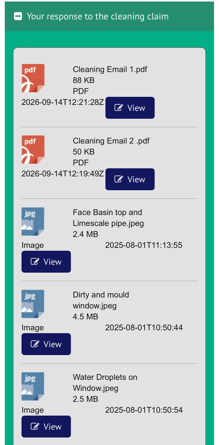
The screenshots are from a real claim response, captured on a phone. The notes are my own observations from using the page, not the result of a study. In these screenshots the deposit status was Evidence gathering complete, so the files are shown read only. The adding and removing states in the redesign are my proposals for the stage before that, shaped by the feedback below.
-
Raw timestamps
Dates appear as 2026-09-14T12:21:28Z. A tenant has to decode them to know which file is which.
-
One big button per file
Every row carries the same large View button. It takes more room than the file name, and there is no preview of the photo itself.
-
Rows that do not line up
The date sits under the icon on PDF rows and over to the right on image rows, so the list is hard to scan.
-
Icons instead of pictures
Photos show a generic JPG icon, so you cannot tell the basin photo from the window photo without opening each one.
-
An empty box with no explanation
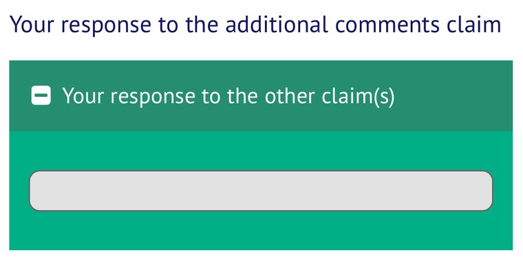
When a claim has nothing to show, the page displays a blank grey bar under a heading. It does not say that nothing was added, or why.
What friends told me
Friends who used the page for their own deposit claims gave me informal feedback. It is not a study, and it is about the upload stage, which I did not capture.
- Deleting several files at once was difficult.
- Adding several files at once was difficult.
- The layout could be better.
- The upload process was time consuming.
One screen, five states
The job stays the same: add files, check them, fix mistakes, then continue. Choose a state to see how the screen behaves. The file names and photos come from the real claim. The empty, uploading, problem and delete states are my design proposals.
{{ cur.title }}
{{ cur.text }}
{{ cur.tagLabel }} {{ cur.tag }}
What I changed and why
-
Show the file, not just its name
Photos get thumbnails and documents get a clear PDF icon, with type and size on one line. A tenant can tell the basin photo from the window photo at a glance.
Answers problem 4
-
Readable dates, in one place
14 Sep 2026, 12:21 replaces a machine timestamp, and every row uses the same layout, so the list scans top to bottom.
Answers problems 1 and 3
-
Tap the row, use the menu
The repeated View buttons go. In this concept, tapping a row opens the file, and the menu on the right holds actions such as View and Delete.
Answers problem 2
-
Add many files in one go
In this concept, Add photos opens the phone library with several photos selectable at once, and each file shows its own progress. Ten photos become one action, not ten.
Answers feedback: adding in bulk, and time taken
-
Fix mistakes in one go
Tick several files, then delete them together. A confirmation names the files, so the wrong ones are not removed by accident.
Answers feedback: deleting in bulk
-
Say the limits, show what is there
File types and the 10 MB limit sit inside the upload area, a count and total size sit above the list, and an empty list says so in words instead of a blank bar. A failed file says why and what to do next.
Answers problem 5 and prevents dead ends
Built for a thumb, readable by everyone
- Rows and buttons are at least 44 pixels tall, so they are easy to tap on a phone.
- File details are 13 pixels or larger. The first mock used text closer to 11 pixels.
- Problems are shown with an icon and words, never colour alone.
- The design calls for labelled checkboxes and menus, so a screen reader can name each file and action.
- Layout is built for a phone first, since that is where the page was used.
Untested so far
I have not tested this redesign with users yet, so I am not claiming results. The plan is five people who have answered a deposit claim, or could. Each gets one task: add three photos and two emails in one go, remove the two wrong files, then continue. I will record pass, pass with help or fail, how long it took, and how easy they found it on a 1 to 7 scale, then add the findings and what I changed because of them.
Assumptions to check
- I do not know the service's real rules, such as whether evidence is optional or exactly which file types it accepts, so the states beyond the real files are assumptions.
- I could not capture the current upload and delete steps, so I cannot show a before for them. For those two, my evidence is friends' feedback, not screenshots.
- The timestamps in the current page may be in UTC. I show them as written, without the time zone.