Can I still make this train, and where do I go?
Rail journeys fail in the moments between trains: finding the platform, handling a delay, working out what to do next. RailSmart is a mobile app concept that answers those moments in one place. I designed the flows and the low fidelity screens.
- MY ROLE
- UX Designer, working solo
- PROJECT TYPE
- Concept project
- SHOWN HERE
- Nine low fidelity screens and the design decisions in them
- TOOLS
- Figma
The stress is in the gaps between trains
Most journey tools answer one question: which train? Travellers under time pressure are asking another: can I still make it from where I am standing, and which way do I walk?
That question gets harder at interchanges, when a platform changes, or when a connection tightens. RailSmart is organised around those moments, so the screens lead with the platform, the time left and the next action, not the timetable.
The project began with a photo of a real station departure board: a cancelled 13:45 service to Reading and wheelchair accessible zones marked at carriages 2 and 6. Both details became features, a cancellation reroute and a wheelchair zone planner. My working hypothesis was that existing apps plan the journey well but stop helping once the traveller is inside the station.
Four travellers I kept in view
These are working personas, built to test design decisions against different needs. They are hypotheses to validate with real travellers, not findings from interviews.
Maya Chen
31, daily commuter
Wants speed, and alerts that count the time it takes to walk to the platform.
Derek Hollis
68, accessibility focus
Needs step free routing and voice guidance.
Priya Nair
22, international student
Needs plain language and offline station maps.
Tom Garrett
38, field sales representative
Needs proactive rerouting around disruption.
Five jobs, nine screens
I grouped the screens by what the traveller is trying to do at that moment.
-
Plan
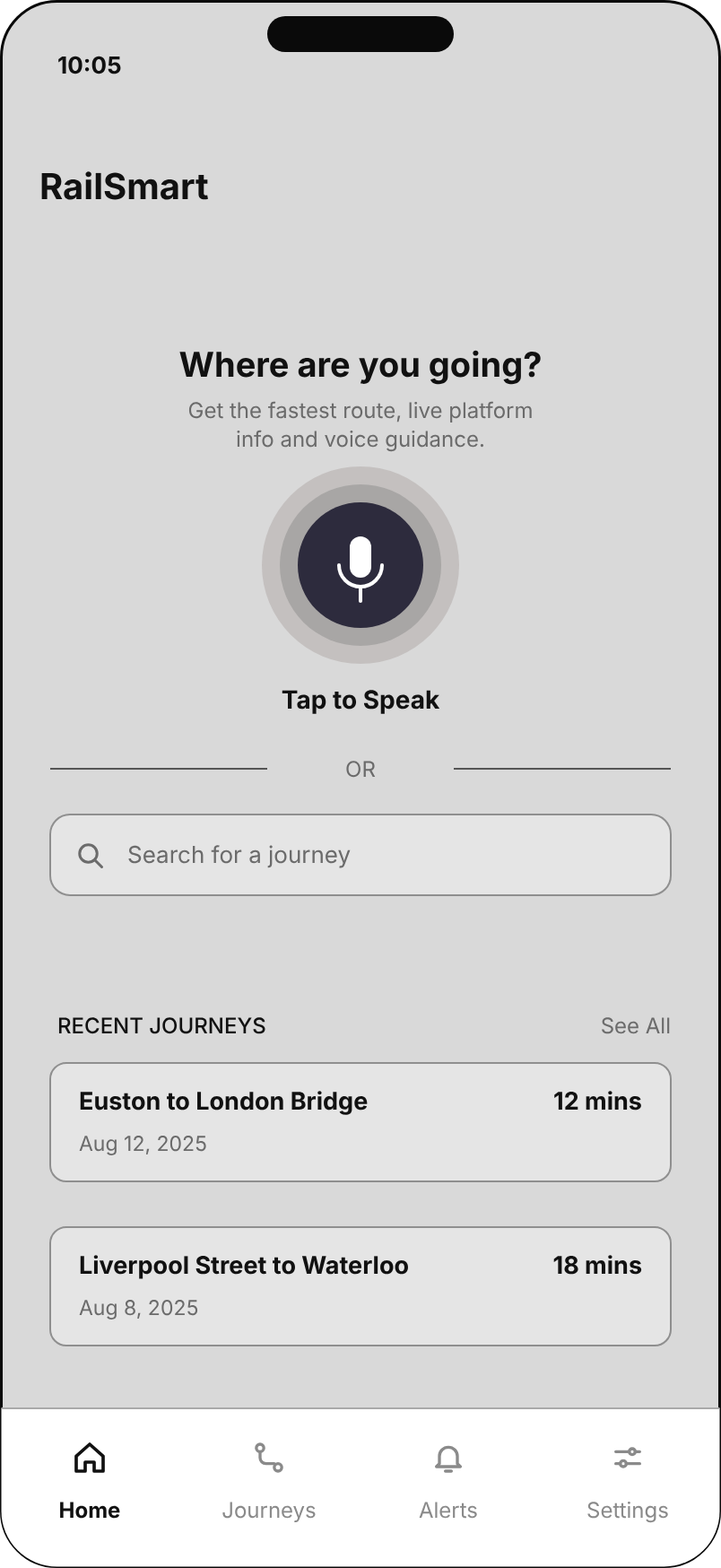
Say or type where you are going and get the fastest routes, each with the time to spare shown in plain words.
Home, Search results
-
Catch the train
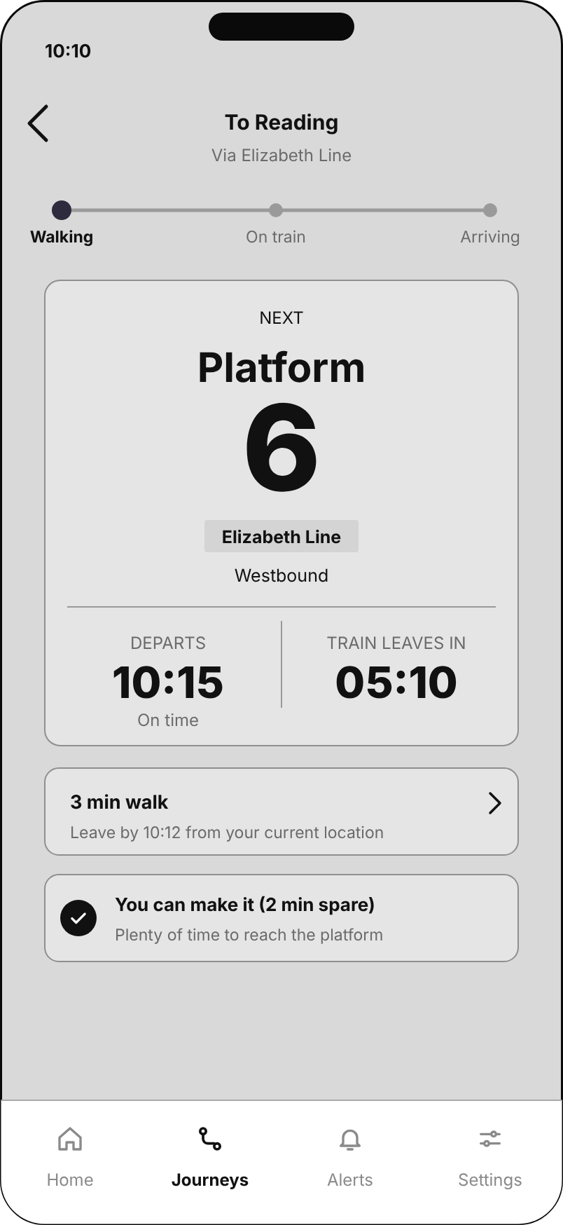
See the platform, departure time and a live countdown, and get told when to leave.
Live platform, Leave now
-
Recover
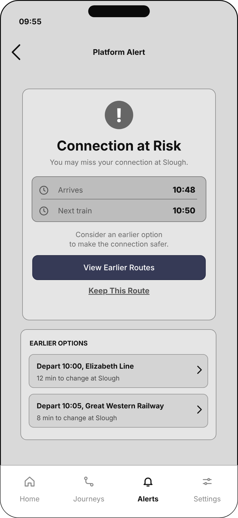
Hear about a risky connection or a platform change early, with a clear next step.
Connection at risk, Platform changed
-
Find your way
Be guided through the station to the platform, and know where to stand on the train.
Station navigation, Crowd level
-
Fit the traveller
Set walking speed, step-free access and which alerts to receive.
Settings
Low fidelity wireframes, in the order a journey happens
Use the arrows, the thumbnails or the left and right keys to step through the journey. Select a screen to open it full size.
SCREEN {{ wfCur.n }} OF {{ wfCur.total }} | {{ wfCur.job }}
{{ wfCur.title }}
{{ wfCur.text }}
The process ran from six sketch concepts (Home, Routes, Live journey, Alert, Station navigation, Crowd overlay) to these wireframes, then to a dark high fidelity version with one green accent for contrast while walking.
View the high fidelity prototypeWhat the screens are built to do
-
Voice first, typing second
The Home screen gives Tap to Speak the largest control, with a typed journey search under it and recent journeys below. A traveller with a bag in one hand can still start a journey.
Screen 1
-
Show the margin, not just the duration
Each route card says how much time is spare ("You can make it, 3 min spare", "Tight, 1 min spare"), so the traveller compares risk as well as speed.
Screen 2
-
One number at the centre of the live screen
The platform number is the largest thing on the page, with line, direction, departure time and a countdown close by. Everything else on the screen is secondary.
Screen 3
-
Every alert ends in a choice
Leave now, Connection at risk and Platform changed each have one clear primary action and a quiet way out: Start Navigation or Not Now, View Earlier Routes or Keep This Route, View Directions or Dismiss.
Screens 4 to 6
-
Directions stay on screen
The step-by-step walking instructions repeat under each alert and the station map, so the next move is never a tap away.
Screens 4, 6 and 7
-
The traveller sets the pace
Walking speed and step free access sit in Settings so the time estimates can be personal rather than average. Voice guidance can be switched on or off there too.
Screen 9
Twelve proposed features beyond these nine screens
Proposals tied to the personas and the station board photo. None has been tested, and these wireframes do not cover them.
- Wheelchair zone plannerFrom the station board photo: route to the marked accessible zone.
- Cancellation rerouteFrom the station board photo: offer the next options when a service is cancelled.
- Auto delay compensationPrepare the claim when a delay qualifies.
- Offline station mapsStation layouts that work without signal.
- Live lift and escalator statusAvoid a broken lift on a step free route.
- AR platform wayfindingOverlay the route through the station.
- AI journey predictorPredict the likely delay before it is announced.
- Night journey safety modeFavour staffed, well lit routes after dark.
- Student and group fare finderCompare railcards and group fares.
- Business travel dashboardJourney history and expense export.
- Multilingual jargon helperExplain rail terms in plain language and other languages.
- Full voice navigationHands free guidance from platform to seat.
What I would do before calling it done
These screens are untested. I do not claim usability results for them, so this is the plan for earning some. Testing is planned for December 2026 to January 2027.
- Test the flow with five or six regular rail travellers on three tasks: find the platform, decide whether to leave now, and respond to a connection at risk. Record whether they finish each task and where they hesitate.
- Replace the simple station plan with a real indoor route for one station.
- Build the high fidelity screens, then check text contrast and touch target size against WCAG 2.2 AA.
- Add a settings model that stops the walking speed choices contradicting each other.